

Google has been rolling out their new search results pages for the last week or so—finally taking them live globally today (March 13th). The new design removes underlines from titles in favour of larger fonts and bold text. Most significantly, however Google has changed the way it labels its paid search results in opposition to its organic search results—making the difference much clearer and easier to identify for users.
Prior to the update the results pages looked like this:
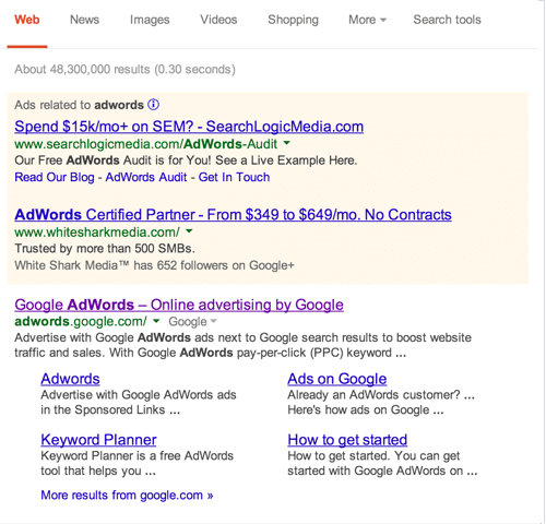
with paid search results appearing in front of a background of beige. Currently, They look like this:
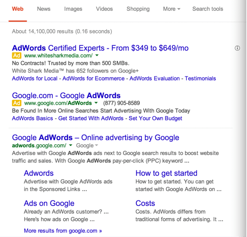
with paid search being labelled as adverts with highly visible yellow squares.
This is a vast improvement in terms of identifying paid adverts over organic search results as rumour has it that Google has been incrementally lightening the beige background they (until today) backed their paid results with—meaning that, over time, it became easier and easier to mistake the paid results with the organic ones. Personally, saying this as someone with a lot of experience with both paid and organic search (maybe it was my monitor), I found it hard to distinguish between the white and the beige often.
However, Google insists that the purpose of the redesign is to update the look of the results pages, which it certainly does.